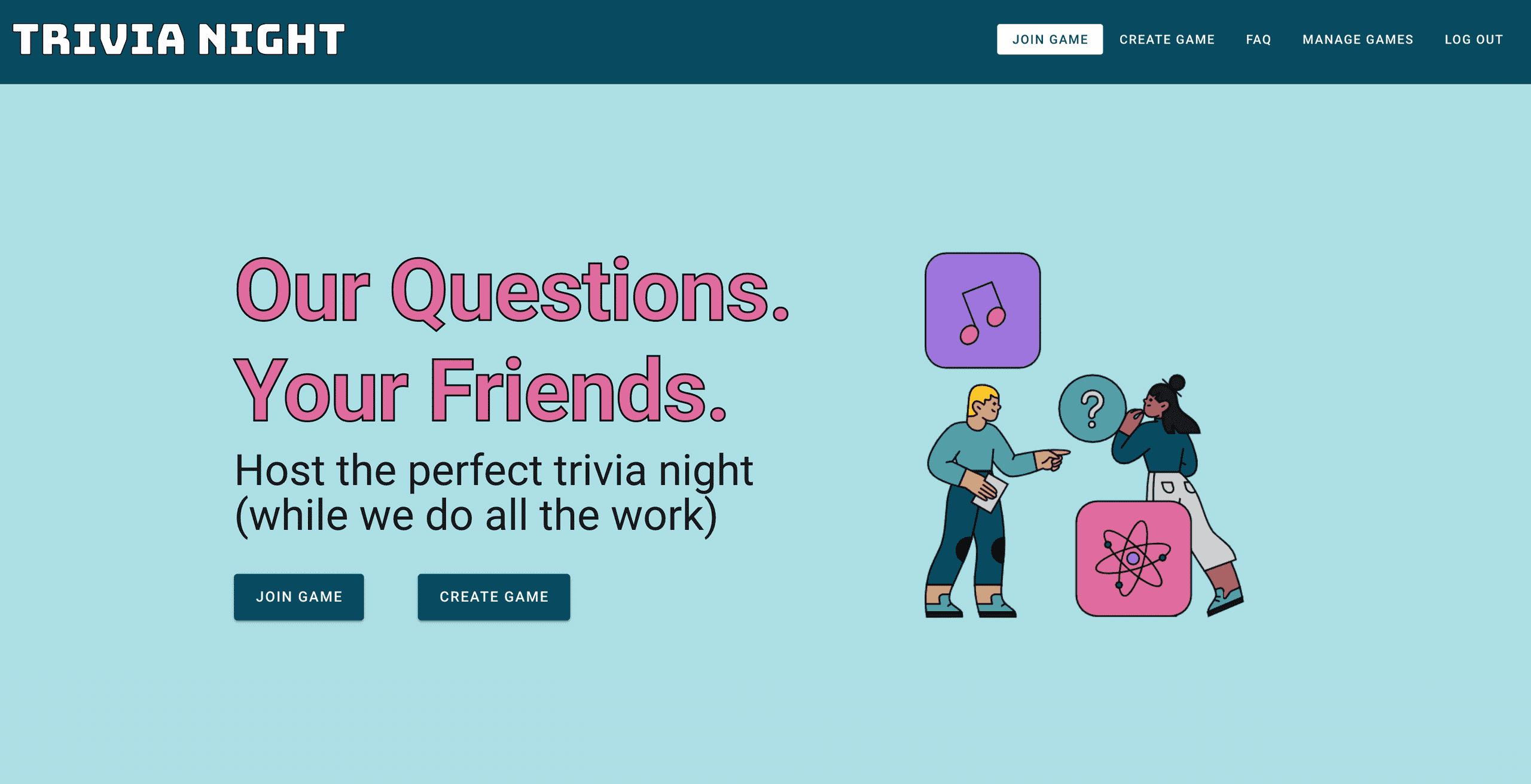
January was the first full month I've spent working since I quit my job, and it felt good to get into something of a rhythm. I made a ton of progress on Trivia Night and I feel tantalizingly close to launching it publicly.
Let's find out if I met my goals!
Goals From Last Month
Get three people to run a trivia round through Trivia Night
Grade: B
I got two volunteers and a ton of good feedback. More thoughts on this below!
Clean and publish ten full trivia rounds for external consumption
Grade: B
I only ended up publishing eight rounds (40 categories), but I'm not too sad about it. My initial plan was to turn the massive number of questions I've written into a selling point. However, I realized that 300 categories might just be overwhelming to outside visitors trying to create their first game. Instead, I'm planning to consistently add a round or two per week to keep customers coming back.
Publish another crossword on Black & White Crosswords
Grade: A
Success! I decided to make a themeless puzzle to ease back into the waters (themeless puzzles are significantly easier to create), and I think it worked. I had a ton of fun making this and already have a few more ideas for future puzzles. Stay tuned!
(Note to interested parties: I also fixed the annoying puzzle navigation defaults while I was in there. It now skips over filled letters as you would expect it to. Sorry it took so long!)
How I Spent My Time This Month
No surprises here. I again spent almost all of my working hours on Trivia Night. While I added a few new features on the engineering side this month (payments!), most of my time was spent well outside my comfort zone, on visual and UX design. Even though I've been coding for a long time, little of that experience is in making user interfaces, and even less is in designing them myself.
To make matters worse, I routinely get frustrated with bad UIs, and love when things look pretty. While I've still got a ways to go, I spent much of this month on a design crash course to stop myself from hating my own site. Here are some of the tools I found most helpful:
Vuetify (Design Framework)
The specific tool you use doesn't matter too much here. I use Vuetify, which is a Vue-based implementation of Google's Material Design design language. But the important takeaway is to use a design framework, period.
The benefits are enormous. Building a ratings feature into your app? Bam! Here's one designed by a professional designer, that uses concepts familiar to every user, and you have to spend zero time implementing.
Worried it won't feel like "you"? Then use alien heads instead of stars! Change the color! Add more aliens!

If it's a good idea to make changes to a component, the designers will have thought about the best way to do it and made it easy for you to configure. And if it's a bad idea, then it's probably hard to do. These types of guardrails are extremely helpful for someone just getting their design feet under them.
Coolors (Color Scheme Comparison)
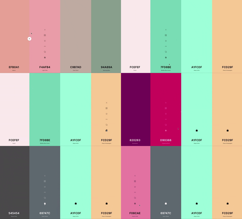
In the past, when I visited a website, I'd quickly know whether or not I liked the color scheme, but I couldn't imagine trying to come up with one from scratch. How do you know what's going to look good together before you see it? Turns out you don't have to if you use Coolors.

It shows you colors at random, and when you see one you like, you lock it in place. From there on out, The Algorithm only shows you colors that it thinks will complement your locked selections. Before you know it, you've got a full color scheme ready to try out.
Designstripe (Website Images)
(Confusingly, no relation to this author's former place of employment, which is known for their good design.)
If you've ever wondered where every startup website gets those cute, cartoony illustrations they use, the answer is probably DrawKit. They've got tons of designs for all sorts of situations and businesses, all for low prices.
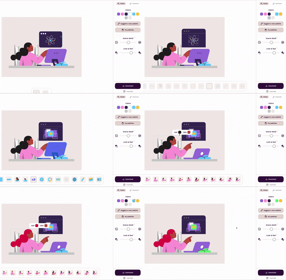
When I was trying to design the homepage for Trivia Night, I was planning to use DrawKit until I found out about Designstripe, an even more customizable product from the same company. For cheap or free, you can take a basic scene and customize it to use the color scheme and illustrations that work best for you.

The assets they provide obviously won't cover all situations, so the site can't replace customized images from a real designer. But at such an early stage in development, getting relevant, color-matched illustrations for free almost feels like cheating.
User Feedback
I've been writing software for other people for ten years now, but it still continually surprises me how little you know about your product until you let someone else use it.
When I'm testing my own code, there are two classes of bugs that I'm most likely to miss:
"Why would you do that?"
Engineers spend a lot of time covering "edge cases," which they might envision as something neat and tidy like the user entering invalid data into a field. But I find that the "edge cases" that come back to bite me the most are what your customers might call "using the product." These are things like clicking on buttons at random trying to figure out how to do something, or reloading the page in the middle of filling out a form because you accidentally swiped down on the screen.
These actions say nothing about the intelligence of your users. They're exactly the things I do when trying an unfamiliar product! But when you're creating something, you never go through this period of exploration, and end up missing some glaring mistakes.
"Obviously, you just..."
It's hard to call these "bugs", since nothing is technically broken, but I think they're even more insidious. When testing out your own code, you always know what you're supposed to do next. Even when you try to put yourself into the mindset of your users, you're likely to notice only the most obvious sources of confusion.
Your users have no frame of reference for what they're "supposed" to be doing, and will end up confused and annoyed if you don't point them in the right direction at every opportunity.
While I think it's possible to improve your ability to find both of these error types on your own, nothing will ever beat watching someone new experience your creation. Thanks to those who have tested so far, and feel free to contact me if you're interested in helping!
Goals For Next Month
Even though I have a million ideas for how to improve Trivia Night, I think it's fully-featured enough to start looking for external users. Unfortunately I have no idea how to do that!
1. Post about Trivia Night in three different places
I think the product occupies a small enough niche that I won't have much success using traditional advertising. Fortunately, trivia buffs usually like the internet and like to hang out together! I'm going to try posting about the site in a few of these places to get some initial reactions.
2. Wade into the waters of SEO (Search-Engine Optimization)
I'm no expert, but it seems like a bad sign when your site doesn't show up in search results for your exact URL...
Let's see if I can change that!
3. Start my next project
I still expect Trivia Night to be my primary focus over the next few months, but I also don't want to blindly add features that no one wants. I'm going to attempt to focus my Trivia Night effort on getting some users, and channel my engineering time into my next idea.
See you next month!


